

These are the 2 “posters” required for this project. The two themes propaganda (a personal reaction connected to [but not exclusive of] the execution of Osama Bin Ladan) and the second a slight modification of the “movie” theme and morphed into a book announcement for the “book” project that follows this one.
To achieve the expanding text for “No War,” I used the Warp Text tool, selected the “Arc Upper” style, and zeroed out the Bend and Vertical Distortion and maxed out (100%) the Horizontal Distortion. It was then just trial and error in determining the correct size and typeface to fit the diagonal shape (with a little free transform thrown in). Overall, I’m pleased with the result.
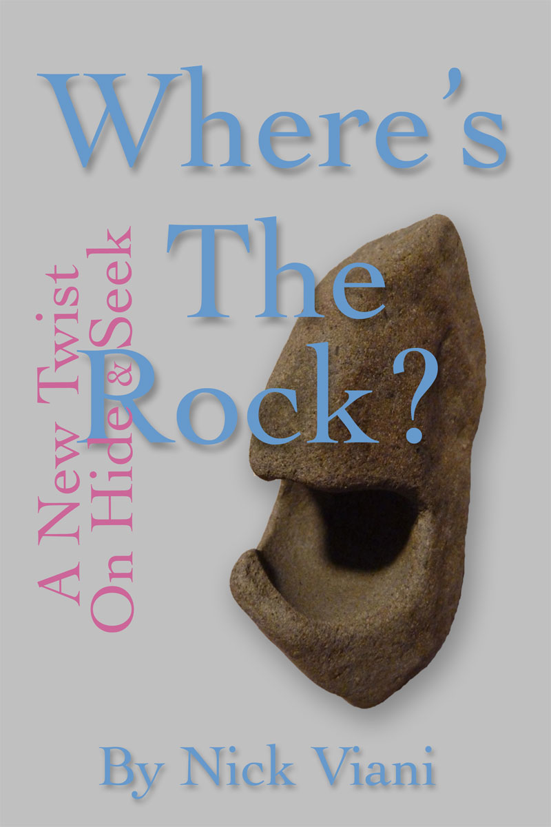
In the book poster, I employed a subtle drop shadow to emphasize the primary text (and the image) and had a good time experimenting with settings. There’s no one size fits all when dealing with drop shadows and text, however, and when reducing the font size (e.g. the author), the relationship between the text and the shadow was reduced.
The Stenberg brothers interesting movie posters caught my attention, particularly their use of diagonal lines. The No War poster applied that to a degree, and provided the compositional opportunity to integrate the shocked face speculating what would happen if we were not involved in a war. The dates correspond to years the US was or is currently at war.
For the book poster, I felt the rock had enough character to offset traditional text positioning, both vertical and horizontal.
I’m not sure if either poster succeeds, partly because No War throws a lot of information to the observer but similarly is vague about what the dates mean. Graphically, however, it’s a scream (yea, I know). As for the book poster, it’s going to be a child’s book but there’s nothing child-like in the poster (except, perhaps, my choice of color for the text). So I may return to the poster as the book project proceeds, and play with the poster a bit more.